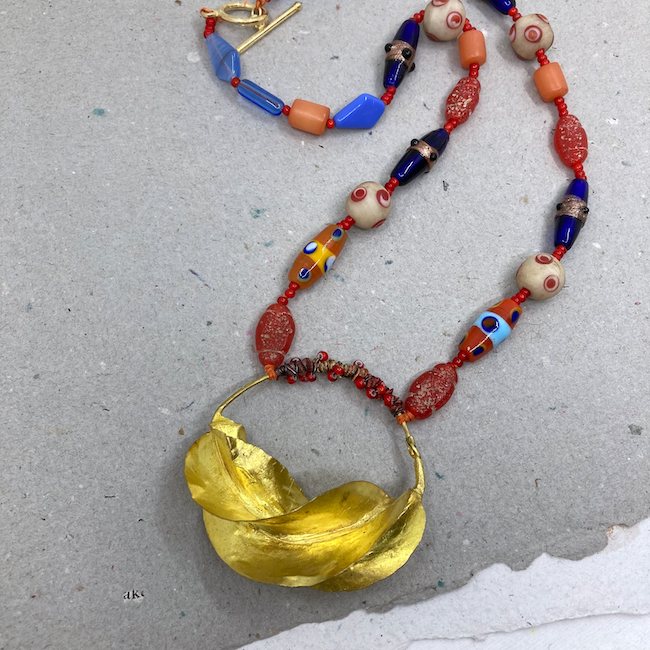
Allegory Gallery sold Fulani earrings in one of their lives. I’ve always loved them, but I don’t wear earrings. I always look at earrings and earring pairs to see if I can use them in another way. I thought I could use these, and then either Andrew or William mentioned the same on the live, so I bought a pair.
I considered quite a number of beads to go with the earring-now-pendant. It would go with so many things. I didn’t want the connection points to slide to the top of the hoop, as they would inevitably do. So I wound it with a length of ribbon (that I got with a Mary Harding order). I wrapped over the ribbon with wire and small red white heart beads. I love white heart beads, and buy them just about every time I see them. They make wonderful spacers.
I chose primarily manik manik glass beads in red, blue, and orange. I also have some orange barrels that are a lighter material, I’m not sure what. Then as I got toward the back, I wanted something a bit lighter. I was looking in my Ava Motherwell stash thinking I might have some resin, but found some vintage glass in a light blue that echoed the blue stripe on an orange bead from the front. I always appreciate connections like to bring the eye around a piece.
I really like the way it turned out. I’ll have to think about how I want to style the other one.
I made a pair of earrings and a necklace this weekend. I made the earrings during the Allegory Gallery Creative Make-Along. It was for the garnet kit, but I didn’t have that, so I was considering other AG items. I didn’t get a lot done, but these earrings are cute. I call them Star Light, Star Bright.
I used Czech glass star shaped flower beads and pewtie spacers from Allegory Gallery along with vintage crystal tubes. Cute!
I love the colors in this necklace. It all started with the beautiful pendant by Kelly Luttrell of Soul Relica Handmade Components & Jewelry. I used those to decide on my bead choices – pink opal and vintage seafoam glass from Allegory Gallery. I used one long gemstone (moonstone?) bead on one side. I thought about using a vintage sterling teardrop shaped box clasp with a set stone (garnet or garnet colored crystal) because I liked how it echoed the shape of the sapphire in the pendant. But it wasn’t quite right because it was too refined. I wanted something to match the rustic elegance of the rest of the piece. I’m happy I kept looking through my box of clasps and found the beautiful copper and solder toggle by Mary Harding.
I bought two boxes of surprise goodies from Tucson, one from Ava Motherwell and one from Allegory Gallery. It was fun anticipating what would be in the boxes, and now it is fun starting to use them. Both were generous, and the Ava Motherwell box was from a chosen color theme. I chose Morocco which was teals, mustard, and carnelian. Those are a great color combination, so I knew I could make something using primarily materials from the box.
I designed the necklace three different times. First I used four of the large pieces in the pendant directly on the wire of the necklace. Although lightweight, being so much larger than the other beads, they made it hang in a manner that I didn’t like, kind of square. (Now I have two left. I’ll probably make earrings.) Then I tried to make two different pendant sections and hang them from a large jump ring, but it just looked messy. Finally I decided to make a long pendant and thought I was going to add some larger turquoise jasper beads, but I really liked what I already have, so I left it.
Most of the materials are from the Ava Motherwell box. The crystal rondelles are from the Allegory Gallery box. The two turquoise discs and the etched blue ring the pendant is attached to are from my stash. Mary Harding made the clasp.
I really like the colors so much and the finally realized design.
Mary Harding makes gorgeous rustic botanical components. The colors she gets are so lovely, and her black and white pieces are striking as well. I fell in love with a tall black and white pendant. I wanted to keep a more monochromatic color scheme, so I used a couple of large hole moonstone to cover the crimps near the pendant holes, labradorite nuggets and crystal quartz.
Brenda Schweder has been doing collaborations to collect items for an auction to raise funds for Beads of Courage, an organization that provides beads to kids with serious illnesses to give them a way to communicate about what they are experiencing, as well as other arts-in-medicine programs. This time, she offered up wonderful components from her collection. Those of us who chose to participate get those, make something with them and send those pieces back to be auctioned off (at a later date – details to come in an upcoming blog post.)
I haven’t been super inspired lately, but Brenda‘s collection got my wheels turning. She had so many pieces I could envision making into something. I got three things: a coin, a billy goat milagro, and an open metal work curved brass piece.
I sketched out ideas for these in my mind while they were winging their way to me. I stuck pretty closely to those ideas for the milagro and the coin, but the brass piece proved a bit more problematic to bring my original vision to life. Brenda had really set my mind at ease by telling participants not to worry about making “a design for the ages” just something with our spin on it.
I made the coin necklace first because it was the most straightforward. I added a Swarovski cyrstal and put it on some mixed metal chain. I really love it. I wanted to make things that I would see and want to purchase in hopes that other people will too in order to raise money for Beads of Courage.
Next I worked with the brass piece. My original vision was to wire wrap tiny gemstones along each side, hang something fun off the bottom and then decide what to use as the necklace part. I got out so many things trying to decide what to dangle from the bottom because that would determine which little stone or bead I used to wire wrap along the side. Nothing I tried matched the vague idea I had in my head of rustic chic, so I decided to move on to something else. This Mary Harding pendant really looked great in color, shape and size, so I let that guide my design.
When I tried to wire wrap along the sides, it just wasn’t working. I think I needed a smaller gauge wire or it was the curve or thickness of the metal or some combination of the three. I didn’t have smaller wire (that I could find!) so I decided to move on to bead dangles. I paired the pendant with vintage chain. I love orange and yellow and have been under the impression that other people don’t. I think I’m wrong because so many people really love Pantone’s colors of 2021 (Illuminating – a yellow – and Ultimate Gray.) In addition, this necklace is right on trend since it would work well with other colors in the Pantone Spring/Summer color report such as Marigold, Rust, Buttercream and Willow.
Last I made a colorful necklace in my favorite knotted style with the milagro billy goat. Milagro means miracle or surprise in Spanish, and these charms are common in Latin America and the southern US. They are used in prayers and religious ceremonies, as well as carried as good luck charms and reminders of gratitude. I like the idea of little tokens of good luck and gratitude, and in that way milagros remind me of the use of worry stones. This project was a bit of a construction challenge to get the small milagros to hang so they didn’t cover too much of the goat. I really love how it turned out. For the small milagros I used a rose, a heart, an ear of corn, a clover, and a car. The necklace is made of a variety of Czech glass knotted on waxed Irish linen.
I’ll be getting these in the mail as soon as I can get to the post office so they can make their end of January deadline. I hope Brenda has many things arriving to make the auction a success. Once I know details, I will post them on the blog. It is an online auction, so I’ll definitely be checking it out to see what people made.
I recently got a Foldio2 light box. I’m so happy with it as well as with the customer service of the company, Orangemonkie. Now that I have good light, I want good backgrounds! I’ve had the best luck over the years with nice papers. I’ve had some good art papers, but during the pandemic, I didn’t want to go to the store to rifle through them (and haven’t found any good ones the last few times) so I turned to online choices.
These handmade papers are from White Dragon Paper, and I couldn’t be more pleased.
I got two sheets of white – one because it was 11 x 17 and one because it had some flower petals in it, and I love that. White tends to be problematic, though, so we’ll see how it worked out. The next two are grey which tends to be the best background in my experience (and from what others say). I think of the left one as dark grey and the one on its right as light grey, which I thought would be the better one. I got a brown just to try something else. I figured it would be too dark (it is recycled cardboard) but the shop didn’t have a ton of single sheets.) The last is aged, and I just love it. I wasn’t sure if it would be too busy. On to the experiments!
Resin on light grey
resin on 11 x 17 white
As imagined, this necklace looks better on the grey. The colors are richer, the clarity is better, and the shadows are fewer. There are other factors at play (my editing, how I placed the necklace in the light box.) But I’m never one to spend a lot of time, so anything that makes a photo better without extra fussing is a plus.
Duane Collins of Elements Pottery raku pendant and beads on aged
raku on light grey
I went back to my original blog post about this necklace because I couldn’t immediately recall the raku artist’s name. Oh, these pictures are so much better! Both due to the light box and the background. I chose this necklace for experiments to have something with darker/brown colors. The aged paper is wonderful here! I like the deckled edge, so I left that showing in the upper right on the aged paper. I’ll have to be cognizant of placement in future to make that easier. This necklace pops on the grey too. Both wins.
Both of these pictures are decent. Probably better than many already on my blog. However, I wouldn’t use either of these backgrounds. My experiments were so random. I didn’t get one on grey of this necklace, but I suspect that would have been the winner.
Again, neither of these photos is bad, but I think the crystals and unicorn pop best on the grey. The light grey is good all purpose. I’d like the other white beads to look better. I think they are Czech glass? But adjusting the light could probably improve that. I cared most about getting the AB coating on the crystals. So lovely.
unknown artist starfish on brown
starfish on grey
I do think the brown is a bit dark for many things. I thought that might work for some lighter pieces (like the unicorn) but it doesn’t seem to work for many of them. But I like having it on hand, and it was worth a try. Here the grey is a the clear winner.
Here we have the battles of the greys, and I think the light grey has it. The bead details just stand out better. That could be due, again, to my editing and how I did the lighting, but the darker grey seems to drag the photo down.
Here you can see that it’s not just the background that makes a difference – it’s the editing. I’ve clearly done a better job editing the bottom photo. Taking that extra time makes a difference. I do take a little time when editing multiple photos to get one good one for a post. Editing so many at once made me sloppier!
I wanted to try another necklace with browns on the aged. I’m loving the aged! I didn’t do a great job lighting or editing this; the clarity is not there. But it’s a lovely background for this necklace.
I grabbed these earrings that were sitting on the table just to try something else. The light grey is a nice neutral background. I like the drama of the aged paper. The others, especially the white with floral, will come in handy once in a while. But I’m pleased with what I got. I’ll be looking for some more with interest, like the aged. Feel free to share your tricks and tips in the comments.
I was originally going to make this necklace with carnelian colored glass beads and the vintage green sequins. However, when I was looking at the gorgeous Mary Harding pendant I chose, I couldn’t ignore the tourmaline cubes from Dakota Stones sitting nearby. They were such a beautiful match!
Rustic floral pendant by Mary Harding
I added a dark green Swarovski crystal cube to the pendant and a silver and peridot clasp, which I got from Famous Vintage Bead Hoard Liquidation Destash along with the sequins. I like the contrast of the rustic pendant and oxidized wire with the gemstones, crystal and clasp.
I’ve been wanting to do a studio tour and finally have. I love studio tours and getting ideas from other artists. I mention this blog post from The Polymer Arts Blog (which I call The Polymer Studio because that’s the name of their magazine I get.) It talks about studios in a really helpful way and links to some fun studio tours.
I tried to do a nice intro, but then I couldn’t figure out how to turn the camera around. It did give me a funny post for Facebook!
I am by no means a videographer or a smooth talker, um, but here is a link to the tour. I can’t figure out how to embed it, even though I’ve done it once before. I hope you find it interesting and maybe get an idea for your own space!
Here are links to the artists that I mention in the video.
Find Andrew Thornton’s work (and other fabulous things) at Allegory Gallery
Find Gina Chalfant (I’m sorry I pronounced her last name wrong!) at White Swan Studio
I should have re-listened to the Allegory Gallery podcast with Gina to get that name correct. But this gives me the chance to tell you that Allegory Gallery has a podcast featuring interesting interviews with artists. Check them out here.
I’ll give you a tip. Diane doesn’t post a lot on her site, but you can find some things in shops, at shows or sometimes when she does trunk shows on Facebook. I know as of this writing, Allegory Gallery has a really nice selection of her beads and pendants.
I’ve written in the past about how when I buy curated mixed lots of beads and materials, I often see a design primarily using the lot. It feels a bit like a collaboration with the artist who put those materials together. This time, I got a lot of beads from Staci Louise Smith. She has a Facebook page where she sells a variety of things – her beads, her finished jewelry and sometimes mixed lots of materials. She has fabulous taste and I love her work, so the mixed lots are really fun things I love. Here is what I got.
Photo and dish by Staci Louise Smith
The dish the beads are in was not included, but Staci makes great bowls as well. Check out her shop. At the time of this writing, she had some lovely finished bowls in her shop.
I didn’t use the cool spiral glass beads made from wine bottles or the large and lovely prehnite, but I used all the rest.
I used the Suburban Girl Studio ceramic bead by Diana Ptaszynski as the focal. Diana recently retired Suburban Girl and is now doing business under her name. Check out her fun new stuff. I attached the focal bead to a handmade copper and solder jewelry stringing bail by Mary Harding. I used the green kyanite, peridot and olive jade beads from the lot. I rounded it out with a few mixed beads that Crafty Hope tied onto the package when I bought one of her bracelets (I love using packaging beads!) I had this great mixed metal chain on my table that was perfect to finish off the design.
It’s fun to be able to use materials another artist put together. It helps expand my design sense.
Today is the reveal for the Allegory GalleryMystery Challenge 2! I’m sorry I don’t have a picture of the kit. I can’t even borrow one from the Allegory Gallery blog because it is a mystery kit – no picture. I forgot to take one, and the materials are all mixed with other stuff on my table now. However, you can tell from this picture that the color theme is yellow and blue. Yellow is a favorite of mine, but blue is a bit of a struggle. But not that much because I ended up making three necklaces!
The first is probably my favorite. It was difficult to get a decent picture, so you’ll have to trust me that it is super cute. I’ve already worn it twice. I love how it turned out.
I used part of the strand of lapis rectangles from the kit and separated them with tiny brass drops. I finished the necklace with these cool vintage ball chain connectors and a beautiful Mary Harding clasp. This necklace is great on its own or layered.
This next necklace uses the Mystery Component that Andrew Thornton made and a gorgeous vintage yellow glass bead from the kit. I finished the necklace with some azure agate and metal spacers.
Last, but not least, I used a variety of beads from the kit and my stash to make chain bits to go along with a couple of chain bits I already had. I used a pendant by Yvonne Irvin-Faus from My Elements as the focal.
Thank you to Andrew Thornton and William Jones of Allegory Gallery. These challenges are always fun and feature beautiful kits. Visit the Facebook page to see what other people made. Someone might have even remembered to take a picture of the kit!